


This month I'm critiquing Oliver Wong, who works in the Bay Area but has apprenticed in part with the great Just Shao of Shanghai, China. I recently had a chance to do a collaborative tattoo project with Just and was blown away by his skills and vision. His style is a fusion of realism and a stylized graphic approach, so we see a lot of that influence in the work that his apprentice Oliver submitted for critique. It's a style that involves limited use of outlines, relying on strong shading for structure instead, which is an approach that introduces some new challenges that can make it trickier to make a piece appear strong and clear.
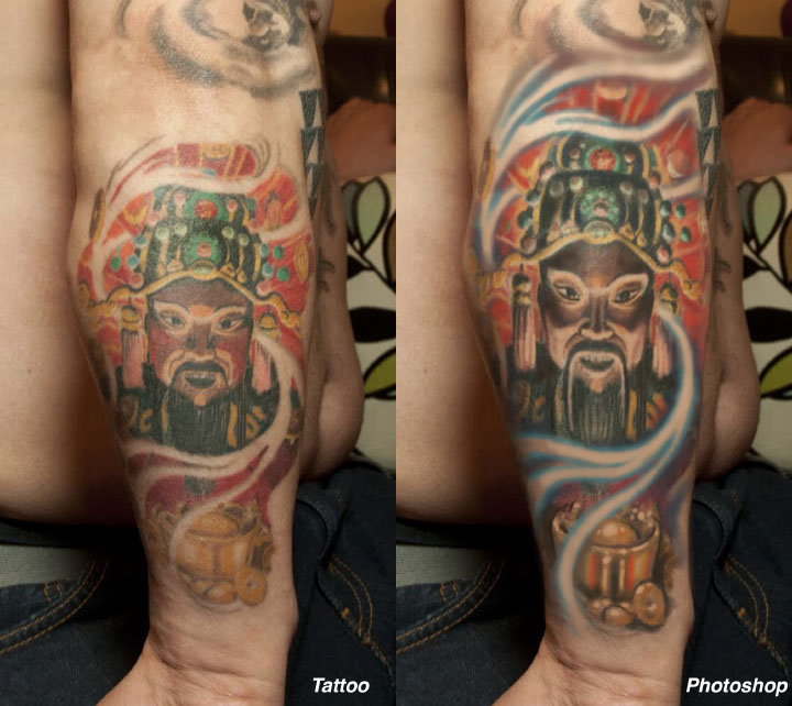
Let's start by looking at the stylized portrait of the Imperial figure. It's a cool image with dramatic lighting, and the use of color and pattern very successfully conveys that ancient, far-East look. I can see that Oliver made an effort to isolate his blacks to make the piece readable, but I'd like to suggest a few ways to push that effect further.
First and foremost, I think the piece is too small for that spot. Whenever a client shows me the piece of skin where a tattoo will go, my first question is usually, "What's the biggest, clearest composition for this spot?" For this piece, I've simply taken the design as it is and stretched it to fill the space. The client is already on their way to filling the whole arm, so it doesn't make sense to shrink the design and leave these useless blank spots. So that's my first move. From there, the blacks are all strengthened, especially in the face and hat, so that the figure stands out more from the complex background. More black shading is added to most of the foreground objects, but none is added to the background, which would simply clutter the piece and kill the luminous effect.
I've also suggested an outline around the bowl in the foreground to make it stand out, but the use of outlines in the piece has been kept to a minimum to maintain the painterly graphic effect. Background details have been strengthened using red and other dark colors, and the lighting on the face has been made clearer, with strong lighting in the underside of the face jumping out from the surrounding black shading. Remember that contrast is all about difference- so a light area will look lighter when surrounded by dark areas, and vise-versa.
I also felt that the color scheme needed some balance, so I brought in some soft cool colors to contrast all the warm reds and yellows. The cools are primarily in the edging of the negative space smoke, which I made more soft-edged to give it an atmospheric feel. To do this, it's helpful to start by making the negative space areas a little wider than you prefer so that the soft edging doesn't close it up too much. There are also hints of cool dark purple added to the black shading, which adds more dimension to the shadows.
So that's three major upgrades: 1) Bigger composition with larger shapes, 2) Stronger shading with larger light areas in between to enhance the contrast in the foreground, and 3) Addition of cool colors to balance the color scheme. Additional detailing and refinement happened along the way as well.
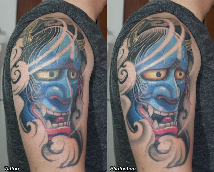
The second piece is a much larger, simpler composition, and already has a great sense of volume. The shading in the nose and cheeks is strong and clear enough to make the entire tattoo look dimensional and smooth. It's already a really nice piece, but since it was submitted for critique, here we go.
This design needs no enlarging- it is already as big as it could go in this spot without going to a full half sleeve (which would be cool too, but not every collector is ready for that). The negative space clouds and wind are a great way to frame the piece off and integrate it into the arm. It's got a lot of good things going for it, so mainly we will talk about polish here.
My first thought was that the forehead is a little pointy. That may be because of the shape of the shoulder, but that's an important thing to look for when the stencil is put on. I've corrected it so it doesn't have that point. You'll also notice how the hair fades out to skin near the top of the head, so that its black shading doesn't merge with the black background. Anywhere there is strong black in the background I generally recommend being cautious about using too much in the foreground as well, so using the gradient in the hair minimizes this problem.
Next, I added a few bold outlines. I know that this wasn't one of the goals of the piece, but especially with a strong design like this I feel that a few selectively chosen outlines in just the right places can really add to the sense of power in a design. I've added them only around the outer edge of the face and the nose... but look at the difference that makes! I've also sharpened the edges around the eyes and added focus to the pupils, which I think are too simple and bland for this tattoo. A little bit of focused detail around the eyes and nose actually helps the piece look more alive.
There's also been a little bit of light gray added to the negative space clouds, which in my opinion did not have enough of the gray range to look full and complete. You can see how the light washes give the whole piece more depth and visual range. I always recommend trying to explore the whole spectrum from dark to light with your shading, particularly with black and gray work, rather than simply using black and one or two shades of gray. The full range is just way more visually satisfying.
So the upgrades on this piece include: 1) Bold outline added around a few key shapes, 2) Detail and focus brought into eyes and other key areas, and 3) Fuller range of grays used in negative space areas, plus a gradient in the hair to separate it from the black background.
I think that Oliver's work has a lot of potential, and it's refreshing to see more of the Chinese influence work its way into the broad stylistic fusion of cultural styles that we all explore as tattooers. Like many up and coming artists, I think his biggest hurdle at this point is simply doing a lot more tattoos, and with an already distinct stylistic flavor in his palette, it's only a matter of time and effort until his work morphs into something quite impressive.
Thanks to Oliver, and to the whole crew from Shanghai who visited us here at Hyperspace Studios last month. It was a truly eye-opening week... anyone who wants to check out the sleeve that Just Shao and I did, you can find it on my @guyaitchisonart Instagram feed.