


Latest Ask Guy features new critique format plus new critique video
We are well into the second year of taking questions of all sorts from both artists and collectors, and have had many questions about improving overall tattooing. I think the best format for this is in doing critiques, which allow for an in-depth look into an artist's strengths and weaknesses. Although I'm not getting into any specific technical nuts-and-bolts stuff here, I've always asserted that basic design, layout, and overall art skills are a critical foundation to good tattooing, where the technical part is almost secondary. So let's talk about the art part of it- the clearer of an idea you have about how you want your tattooing to look, the easier it is to find the right technique to pull it off.
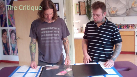
This month's submissions are from Lee Pickles of Spektra Tattoo in the UK. Lee sent a variety of pieces in a number of different styles, including biomech, realistic portraits, and black and gray. I've narrowed it down to these three because I think they give an opportunity to talk about some really practical matters in tattoo design. For all of these examples I've done some Photoshop manipulation to the original photos to give you a better idea of what I'm talking about, and have made a point of labeling which photos are of the original pieces and which have been retouched.
.jpg)
Let's start with the black and gray piece. It's a nice overall layout, with a large defined foreground shape and a softer background, but there are ways that all of these things could have been taken further. For starters, I always recommend choosing which elements you will be using strong black in- usually either the foreground or background, but not both. So you can see that I've gone darker with parts of the cow skull, including stronger lines and areas of heavy black, and have gone a bit softer with the background, eliminating some of the darkest tones and keeping most of the detail in the 50-60% value range, while the skull uses the whole range. I've also added an area around the skull where background detail drops out, making it easier for the skull to pop out from the background.
I've done other things to the skull too. It's about 10% bigger, with the thought that a bigger foreground object allows for more detail rendering in the foreground and eliminates some of the dead space in the background. In general I always recommend aiming for larger foreground objects and less background, just as a rule of thumb. Nothing critical has been lost from the background, although it has been softened so it will drop back more. The road has been clarified too, and the mountains have been smoothed out a little- any abrupt dark areas can cancel out the nice distance effect here. The sky has also been given a bit more character, almost like old school tattoo clouds but much softer and lighter.
Some of these changes could be made to the actual piece, especially the stronger lines and more focused detail in the skull, plus the added sky elements. As far as the other lessons- bigger foreground shapes and softer far distance elements- those are things can easily be applied next time a black and gray project walks into the shop. Anyone who reads a lot of my critiques, though, will see that I am always preaching about bigger shapes. If only one thing is gained from this critique, that would be a good one.
.jpg)
Next let's look at the crazy Dali portrait. First of all, I'd like to say that this is a really cool piece, a very unique twist to a realistic likeness. I believe Dali would have approved wholeheartedly. There are not a whole lot of things that I think would improve it without just making it a totally different piece, so I'll keep this critique sort of minimal. One thing that often will really benefit a piece is simply upping the contrast- taking the darkest 10% of the tattoo, and making those parts 10% darker. I understand that this photo does have some glare, but even in correcting for that I think it's safe to say that more contrast would be a good thing, especially in anticipation of these midtones getting 20-30% lighter over the first 5-10 years. Some of the hexagons could stand to be a bit darker too... and I've added a couple loose ones, which I think makes for a more dynamic integration into the arm.
One thing that stood out to me from first glance is that long forehead wrinkle, which produces a sort of shower cap effect. So I broke that wrinkle up a little. I know it's too late to do that in the actual piece, but if the client is willing to get back in the chair to pump the contrast a bit, it would serve the piece well in the long run.
.jpg)
Finally, let's take a look at the sleeve piece. I know this is only one view of a wraparound sleeve project, but I wanted to concentrate on this part because it has some common mistakes in it which I'd like to talk about. It's also got some interesting energetic effects that I think work really well, and is done in a fairly striking kind of painterly technique which almost works.
Since I've already brought up the bigger shape thing, let's start with that. The figure is really way too small, and although I know that a certain amount of background is needed to accommodate the electric effect, the composition doesn't need nearly that much. So I've started by making the figure as big as possible in the space beneath the Celtic hammer, with enough distance between hammer and figure to allow for the electricity to interact nicely between them. With the figure being larger, that made room for more rendering and detail, particularly along the edges of the figure where the skin tones meet the background. In many places that edge is lost in the original version, so I've darkened and sharpened the edge where needed and made a bit more of a white outline outside it to give it more twang.
There is also a second version I did where this size thing was taken a step further, with the hammer being shrunk and set at an angle to make more space, and the warrior made another step larger. Now the figure runs the whole length of the forearm, which is a good size for a full figure in terms of readability and longevity. Since the approach to rendering this piece is loose and painterly, I tried not to make it too graphic and clean, but did make a point of clarifying not only the figure's edges but also the arrows, which are hard to read in the original version, and the muscle tone in the warrior. Again, I know that there's some glare in the photo but I can still tell that the figure needs more sharpness and distinction. It can be fun to explore that Frank Frazetta oil painting look on skin, and when it's pulled off right it can be very striking... but there does need to be a balance between the loose brushwork and a clear, readable structure that gives the tattoo the necessary strength.
Overall, Lee, this is very promising work with good rendering and a strong sense of color and shading. Mostly it's just a matter of taking it to the next level with bigger shapes, more dynamic interaction of design elements, further tight rendering in key elements and a bit more graphic clarity overall. This is all very doable with the skills you already have in place, and I look forward to seeing where your work goes in coming years.