


This month I'm taking a look at the work of Colin Byrne of DC Tattoos in Ireland, who aims to be a versatile artist who can work proficiently in many styles. Colin has been a client of mine for several years and we've had a chance to go over his work before, so he's already doing a lot of things that I'd normally recommend. A lot of this has to do with his drawings, which I believe are at least as important as the execution of any tattoo. Colin already knows to use large, clearly readable shapes that flow nicely on the body, to use overlapping design elements to create a sense of foreground and background, and to use shading and large gradients to separate the layers and give the piece depth. So my goal in this critique will be to focus more on the application of these tattoos and talk specifically about how to make the work cleaner and smoother.
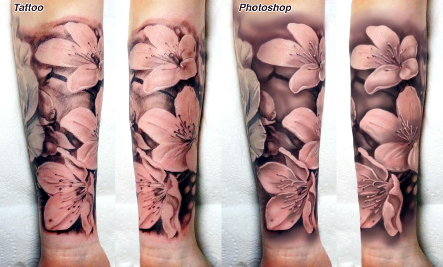
First, let's take a look at a realist black and gray floral tattoo which he's done on a very pale-skinned client. First, some positive feedback: This is a well-balanced tattoo design here, with several large and open floral shapes in the foreground, supported by dark shading in the background. It follows the guideline of making the foreground objects large enough that they take up 60-75% of the area of the tattoo, with the background playing a supporting role rather than occupying a large part of the arm. The way that the flowers point in different directions makes the piece energetic and keeps it interesting, and the clear neg-on-pos relationship between the foreground and background makes the piece clearly readable from a distance.
The issues are mainly with the shading and detailing. In a nutshell, I think the shading needs more time and effort put into it to get it looking smooth, basically working the medium and light washes longer, machine running relatively low, and aiming for small-scale smoothness in combination with large-scale clarity. The smoother your fields and gradients are, the cleaner and stronger your work will look, even with a no-outline tattoo such as this one. Note how I've deepened all of the background shapes to a point where they don't have any areas that are as light as the foreground, and smoothed out the shadows, especially where the tattoo transitions into blank skin at the top and bottom of the piece. This will go a long way toward making the layers separate nicely. Keep in mind that these medium tones tend to lighten up a bit during healing.
There's also some detail that I've added in the centers of the flowers; I believe this is more or less the effect that Colin was aiming for, although with more time and effort put toward it. Having smoother and cleaner detail rendering makes a tattoo more rewarding to look at up close, and remember that a tattoo collector will be looking at their tattoos up close for many years, especially on the inner forearm- that's a place where I always try to really nail the detail rendering.
As far as white highlights go, on someone this pale, white will be only slightly visible. I recommend handling your highlights mainly by leaving empty skin in highlight areas, so that all of the highlighting effects are in place before any white is applied, and the white pigment, when placed in those areas, adds another couple percent to their brightness.
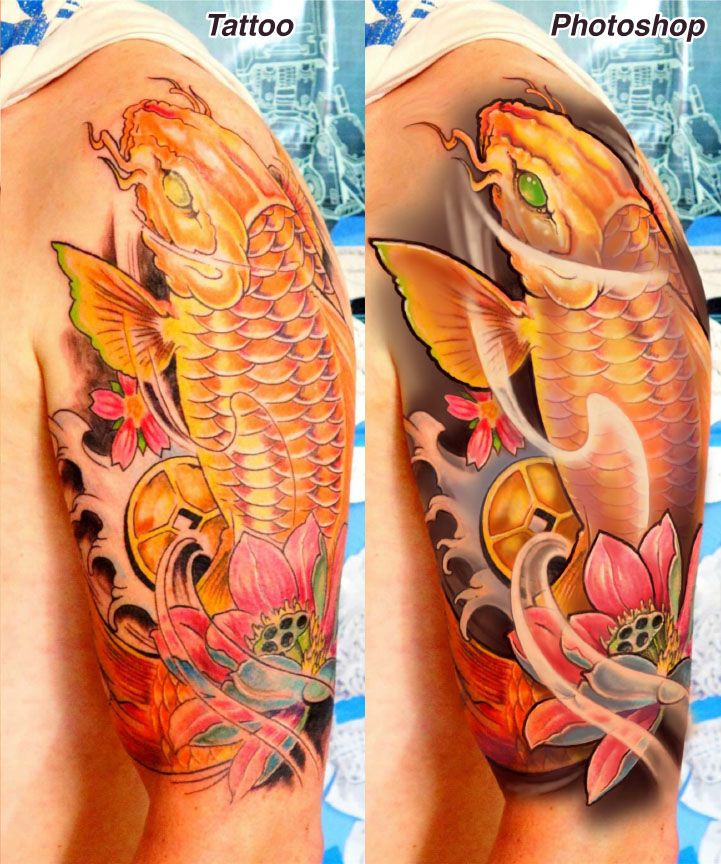
The other piece that we're looking at today is a koi tattoo, laid out in a more or less traditional Japanese style with just a touch of personalized effects thrown in. It's a good layout on the upper arm, with the koi extending the full length of the area in a flowing curve, plus additional movement done using water and wind. It's a readable execution, with strong black shading in the background popping out the bright warm colors of the foreground. So there are plenty of good ingredients in this tattoo; now let's take a look at some ways that the piece could be made stronger, brighter and more visual. As with many of my critiques, some of these things could be actually done to this tattoo if the client were to revisit, while other things I'm discussing will need to be applied the next time a similar design opportunity comes up.
Anyone who has read my past critiques knows that I'm all about making the shapes in a design large and flowing, and I often look for opportunities in my own drawings to make shapes bigger and the flow of a design more readable. In this case, there is one shape that I chose to go larger on- the pectoral fin, which I've increased dramatically in size to take advantage of that space on the front of the shoulder. Keep in mind that the collector will look at the piece in a mirror most of the time, so taking advantage of the front areas of the panel are important. Other than that I've left the basic design alone.
My single biggest technical criticism here is the linework. One of the first things I do with designs like this is to assign different weights to the linework on the different elements in the design as a way of giving them visual priority. In this piece, the strongest outline goes around the koi itself- this is the kind of bold line weight that I recommend handling with multiple passes from a smaller liner, since giant liner groups tend to make fuzzy lines. The second priority line weight was given to the flower, then the coin, waves and cherry blossom were given simple, single-pass black lines. Scales and flowing negative space are done using medium to light gray lines, which helps to avoid cluttering the piece with too much high-contrast detail. In a tattoo with carefully handled multiple line weights, you'll be able to read the design clearly before any shading has even been added.
The shading is another thing I've worked on a bit here. I think that Colin has already put his darks and lights in more or less the right places, but as with the black and gray piece I've expanded, smoothed out and deepened all of the background gradients. Note how much the pectoral fin and coin pop out with the shading that was placed behind them; a negative on positive (that is, light on dark) foreground/background relationship is a simple and reliable way to make shapes pop foreword. Some color gradients have been brushed into the koi as well to help separate it from the lotus and to give it more of a smooth sense of form and volume. Notice how the body is colored in such a way that includes both the small-scale coloring of the scales and the large-scale coloring of the curved form of the body. Most of the shading in the body is done with color, with almost all of the strong blacks being isolated in the background. Using too much black in both the background and foreground makes for a dense, hard-to-read tattoo.
Next, let's talk about the swooping atmospheric lines in the foreground, since I think a lot of artists are a little confused about how to handle shading and coloring these types of transparency effects. Try to think of them as being translucent ribbons made of a milky material. Outside their outlines (which I think look best as graylings or bloodlines) the background coloring and shading should be unbroken; inside the area of these ribbons, the shading and coloring should be much lighter, with areas of total blankness along the edges of the ribbon. Look at the bottommost ribbon in this piece, both before and after the Photoshopping, and you can see the blank edges that I'm talking about. In the before photo, the flower in the background is the same shade and color both inside and outside the ribbon, while in the retouched version, it is much lighter inside. Look closely at all of the negative space effects that I've worked on here and hopefully the logic of it will all make sense.
Finally, there were a few small touches, such as detail in the face, more saturation and refinement in the lotus, addition of some cool colors to round off the palette, and some adjustments to the finger waves. I'm not a finger wave expert by any means, but I found the existing wave line to be too repetitive so I played around with its rhythm a bit and brought the point of the lowest wave over the edge of the tail to give more of a sense of depth and layering.
Go ahead and send me your work for critique! AskGuy@GuyAitchison.com