Ask Guy December 2012
As seen in Tattoo Magazine, December 2012
Q) I look at a lot of magazines and see this amazing brightly colored work, but the stuff in my collection just looks dull by comparison. The linework and shading looks just fine, and everything seemed to heal the way it should... but the colors just don't pop the way I want them to. Right now I'm seeking an artist who can do some really vibrant work, and I wanted to make sure they are using the right pigments to get these kinds of results. What brands of pigments do you recommend?
A) I actually use a number of different brands, and if you look at some of my older blogs at www.tattooeducation.com, these brands are listed. But I have to say here that the brand of pigment you use is far less important than the artist's understanding of color use. It's perfectly understandable to assume that some technical detail, such as pigment or needles, will determine the brightness of a tattoo, but the fact is that vibrancy is largely determined by good old fashioned color theory.
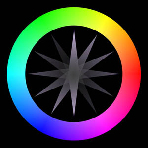
 For centuries, artists have recognized that different colors affect the eye in different ways, and that contrasting them against each other brings out the strongest effects. Colors are loosely grouped into the warm and cool families; the warms being the reds, yellows, oranges and bright greens, and the cools being the blues, purples and blue-greens. These colors are often arranged around what is known as a color wheel (Fig. 1), where the entire spectrum of colors are arranged in order around a circle. The color wheel allows you to quickly determine which colors will contrast each other the most strongly by seeing which ones appear opposite from each other on the circle. Opposing colors are known as complementary colors, and will have the strongest contrast when placed next to each other.
Figure 1: The color wheel. Imagine having a rotating pointer going straight through the center, with its points aiming in opposite directions. This pointer shows you which colors are complementary.
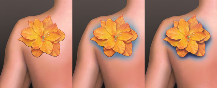
So let's say you want a yellow and orange flower, as pictured in Fig. 2. When placed on blank skin by itself, an orange flower won't pop out that much, even with high quality pigments packed in thoroughly and healed properly. That's because yellow and orange are not that different from skin tone, which contains some yellows and oranges in its natural melanin. To really make these colors pop, choosing a complementary color, such as blue or purple, to place behind the flower can go a long way toward maximizing its impact (Fig. 3).
Then, this can be taken a step further: By pulling dark shading behind the light colors, the lighter tones are able to pop out from the skin far more effectively (Fig.4). This may be hard to imagine, but adding dark shading to the right parts of a tattoo can actually make it appear brighter. In this case, I used a little purple concentrate in the black to help contrast the orange; plus, purple makes for a great shadow color in general. Taking these steps will also contribute toward ensuring the piece's longevity.
Notice, though, how dark shading is used very selectively in the flower, and is mostly reserved only for the background. Otherwise it might cancel out the benefits of using the shading behind the flower, and cause the piece to appear dark and dense from a distance.

Fig. 2,3,4: Counterintuitively, cool colors can make warms appear warmer, while careful use of dark shading can make light areas appear lighter.
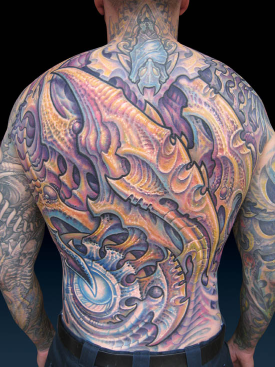
By working generally within these guidelines, there is still a vast range of effective color schemes available. In the case of the backpiece in Fig. 5, I've aimed for maximum impact without necessarily using the brightest color scheme possible. I didn't want to make the tattoo candy colored, so in the foreground shapes I avoided bright red, orange and yellow and instead opted for ochres and other light warm earth tones, along with a few select accents of the brightest yellow. To pop these colors forward, I shaded behind them with some deep black shadows, while avoiding most dark shading in the foreground shapes. Then I packed purple concentrate through the black shading and used a spectrum of cool colors throughout the background. Finally, I layered a bit of deep magenta into the background, which sits on the border between being warm or cool, but creates a strong contrast against the yellows, ochres and moss greens of the foreground.

Fig. 5: Strongly contrasting light and dark, warm and cool, along with some really burly outlines, help give this piece so much impact.
When it comes to finding an artist who can really deliver the goods, though, that really boils down to: How is their portfolio? If they have photos of their work that have the qualities you are looking for, it shouldn't matter whose pigments they are using or what techniques they employ to get the color in the skin. There are many right answers to these aspects of tattooing. When it comes to creating vibrant work, a lot of it is about drawing ability, about the understanding of how to make a good picture. This comes before tattoo technique, and an artist of this nature should have the portfolio to prove it.
I'd like to invite you to come visit my educational website, www.tattooeducation.com. We have a big catalog of stuff there, including a lot of great art books and other items for collectors, along with a library of cutting-edge educational material for artists, produced by some of the leading talents in our industry (Items about tattooing technique will only be shipped to established studios). This includes my magnum opus educational package, Reinventing The Tattoo, where color theory and other crucial design concepts are demonstrated in detail. Thanks, and I hope to see you there!


