


Ask Guy April 2013
Laundry List Tattoos
Welcome to the third installment of my column, Ask Guy, where I'm responding to questions from both artists and collectors. Tattoo Magazine has generously provided me with the space to share these insights, and I want to invite all of you to send me your most nagging questions. Since Tattoo Magazine is available to the general public, I'm avoiding discussion of technical matters and other industry secrets. But I've found that most questions about doing better tattoos can be addressed with discussion of art fundamentals, such as the color theory I touched on in the first column and the article about dark and light from last month. You can contact me with this contact link.
Q) Hi Guy, I've run into this situation a couple times now and thought I should ask you about it. I've got an idea for a half sleeve that I think is killer, my mom and all my friends think it's a great idea too. So I live in California with all these great artists, and I've taken the idea to a couple of these guys, people you've seen in magazines. And all of them have problems with my idea, and say that I want too much stuff in my tattoo.
The thing is, I can't think of a way to use less stuff, because it's kind of like a complete idea. It's for my grandmother Diana, who was a very strong woman and a big influence on me. She identified with the Roman goddess Diana, who carries a bow and usually has a deer with her, showing her righteous nature... I'd like to see her in a strong archer's stance. There needs to be an oak tree too. She's a moon goddess, so you need a moon, and my grandmother was a peace protester in the Sixties, so I want to include a dove. She was a Virgo, and so am I, so I really want to include that symbol, plus her name and an RIP. I'm ready to give my whole upper right arm to this piece, and I'm a big guy. Why can't I have all my important symbols?
A) That's a great question, and something that collectors often run into when they are at a stage where they've graduated beyond small singular tattoos and are ready to start getting large work. Why can't there be room for all those cool ideas in one piece? Doesn't more great stuff packed into a tattoo just make it a better piece?
Simply put, usually not. What makes a great tattoo isn't just the symbolism that's put into it, because your skin is far more than just a page in a book for writing language on. It's an artist's canvas as well, and the most important thing in my opinion is to make it beautiful. When you are wearing art on your skin, it needs to look nice not just up close, but at a distance, in the dark, or across the decades. In part, that means:
> Large shapes that flow nicely on the body
> Strong alternation of dark and light that reads clearly from a distance
Having too many things in a tattoo can run counter to these fundamental guidelines, leading to cluttered, dense work. Sometimes it will look like a number of smaller tattoos that were tied together with filler, and if you're starting with blank skin, that's something to avoid at all costs. The good news is, you can still give your tattoo all the meaning and significance you want without making a cluttered design. Let's look at two different versions of your request.
In Fig.1, you see a version with everything you asked for. It's not a terrible design, but no matter how well executed it might be, it's a weak composition that doesn't have the potential to be a truly great tattoo. For starters, by including Diana's entire figure from head to toe, she ends up pretty small, especially in the face. As a general rule, any face in a tattoo shouldn't be smaller than a quarter or thereabouts, or the features will melt together in a decade.
You can see how, in Fig.2, I've only included the figure from the hip up, and placed her in a foreshortened pose, with the arm pointed into the foreground, making her more dynamic and allowing us to zoom in close without the bow running off the page. This allows for a much more detailed face, and provides enough surface area through the figure and clothes to do some artful rendering. Same applies to the deer: Only about half the animal needs to be shown, allowing us to go larger with the head and get more detailed in the rendering.
.jpg)
Fig.1 & 2: An example of how less can be more. The second example, although simpler in terms of the use of symbolism, makes for a much stronger tattoo design
There are a number of other differences between the two examples as well. For starters, we've removed the lettering and the Virgo symbol, which are distracting and do not make it a better tattoo. Instead, we've made Diana nice and wholesome looking- for those unfamiliar with Diana mythology, she is sworn to a lifetime of chastity. So the Virgo thing is subliminal- if you really need a Virgo sign to celebrate your grandmother, maybe you could get it somewhere else. And the R.I.P. lettering is simply unnecessary.
The trees are now just small and suggested in the background, out of focus... good enough, and they make a nice far background element. There are now a couple doves, but smaller and really just brushed into the background, more of an effect than a distinct element. That allows the moon to be much bigger, which is not only symbolic but just a really nice strong graphic element. Notice how the moon's circle is broken by the overlap of the bow- this is very helpful, since circles usually never look perfectly round on the skin. Breaking circles with overlapping objects distracts from any visual imperfection.
Simplifying it this way gives us a single primary main element- Diana and her bow, with two secondary support elements- the deer and the moon. The sky, trees and doves act as far background, and are done without strong outlines. By trimming out the lettering, the zodiac sign, and large parts of the figure and the deer, the overall effect is a much stronger and more dynamic composition. It's an example of how less can be more.
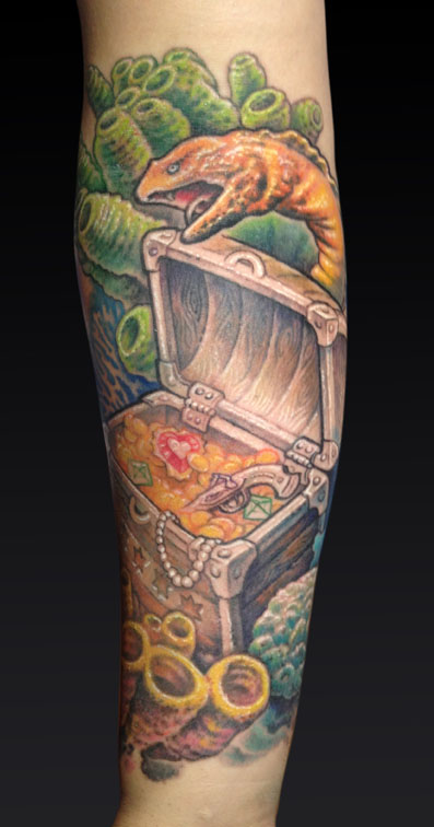
Fig.3: Some tattoos provide ready-made opportunities to add personal symbols without cluttering the design, as with this treasure chest (Work in progress)
There are times when personal symbols can be easily worked into a tattoo without taking away from its visual integrity. Much larger work, such as sleeves or backpieces, has ample room to sneak in a few fun things. The coral reef scene in Fig.3 is a good example. When my client asked for a treasure chest as part of a larger sleeve design, I asked him if he wanted to include anything personal in it. The heart gem is a reference to his wife, who has a similar gem tattooed on her, and the pistol refers to his military career. To any readers from Chicago, you may notice the Chicago flag worked into the design as well.
When I want to do a particularly detailed area in a design, the inner forearm of inside upper arm is a good place. These areas are usually viewed from up close, rather than from a distance, so clutter is less of an issue.
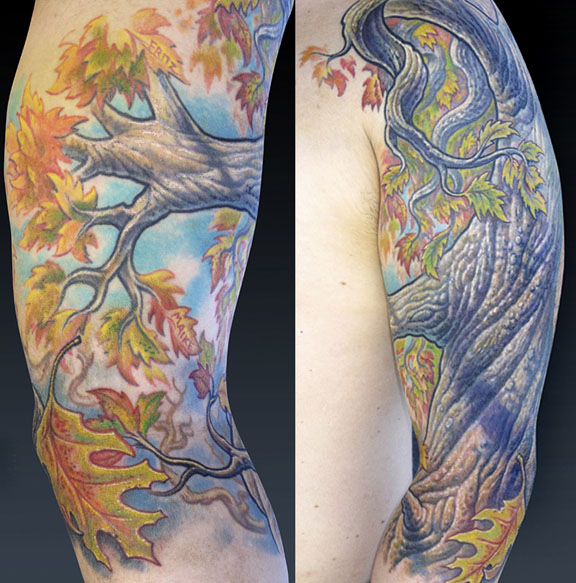
Fig.4: At first I cringed at being asked to put names in some of these leaves, but his kids love the tattoo because of it
Every now and then a client will ask for something that I'm just not sure about. I'm kind of a visual purist when I tattoo, and I don't like sneaking in lettering and that kind of thing because I feel that it adds an unwanted distraction to the piece. On the other hand, it's not my tattoo. Although I can have a certain amount of say over what I'm willing to do as an artist, if some little thing will make a client love their tattoo that much more, why should I deny them that? In Fig.4, I was asked to add the names of the client's kids into two of the leaves. This was after I'd already put many hours into the piece, which is a large coverup working over several tattoos on the upper arm and back. So at first I wasn't thrilled at being asked to add the lettering into what I felt was a carefully balanced large scale composition.
But I caved in, and added the names. I did it somewhat discreetly on his inner arm, toward the front where he could see them but far enough inside so that the names are not visible when his arm is at rest. And as it turns out, his kids are thrilled about being in the tattoo. They'll wake him up in the morning, asking to see their leaves. I've got a toddler running around who is just starting to appreciate my ink, so I can see how this does in fact make the experience of having the tattoo that much sweeter.
So in conclusion, It's all about balance. You want to include enough important symbolism without making an overstuffed tattoo design. Ask yourself what you really are wanting to say with the tattoo, then prune your idea down to the essentials. You can even have a secondary list of optional things you'd like to see in the tattoo if there's room. If you are in fact going to a world class artist like you describe, who has a portfolio you are impressed with- if they like your idea and are inspired to work with it, you'll get their best work if you trust their judgement on the use of symbology and other elements. Remember that often less can be more. You could end up with a much nicer tattoo because of it.
Please drop by my educational website, www.tattooeducation.com, where we offer a stellar selection of books and DVDs by some of the industry's finest talents. Although the technical items are only shipped to established tattoo businesses, we also carry books and DVDs for collectors as well, showing inspiring work in all mediums and celebrating the incredible level of vision in the tattoo industry. Whether you are an artist wanting to improve your work or a collector just wanting to feast your eyes on great art, we hope to be able to help.
Thanks, and I'll see you in the next issue!