


I'm always excited to do a critique, since there's generally such a positive response from everyone. I'm especially grateful to the individuals who are willing to come forward and have their work critiqued publicly, such as in these columns, which are circulated to more people than any other tattoo magazine in the world. In today's column I'll be looking at the work of Brazilian tattooist Breno Bitarello, who recently came through Hyperspace Studios here and got his sleeve started. I've known Breno via various online media for a while now, and have actually had the chance to collaborate with him a bit in the ongoing Biomech Encyclopedia project, which I'll be saying more about in future columns.
Much of what Breno is doing is in the abstract/organic end of the spectrum, which is of course one of my own specialties. So I have the dual challenge here of giving him a solid critique while still encouraging the things that he does that are different from my own work. From his portfolio I've chosen two larger organic pieces, and in my critiques I'll be taking a couple different approaches, since there's more than one correct answer to how to do a good tattoo. As with most of my critiques, many of my suggestions could be applied to the pieces in question if the client were to sit down again, while other suggestions will have to wait for the next tattoo to be put to work.
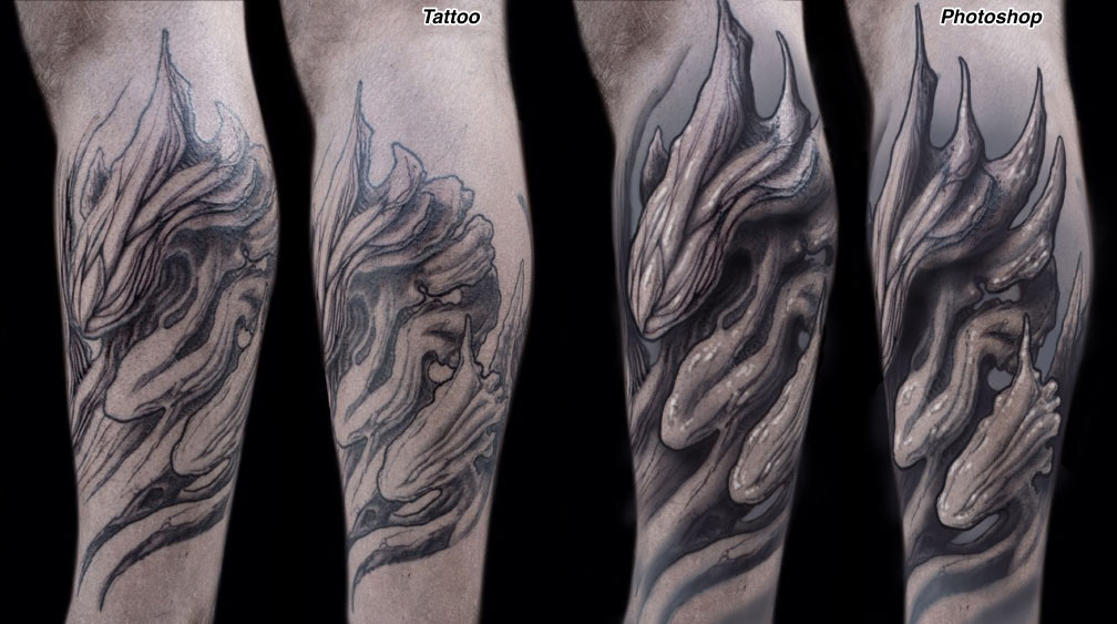
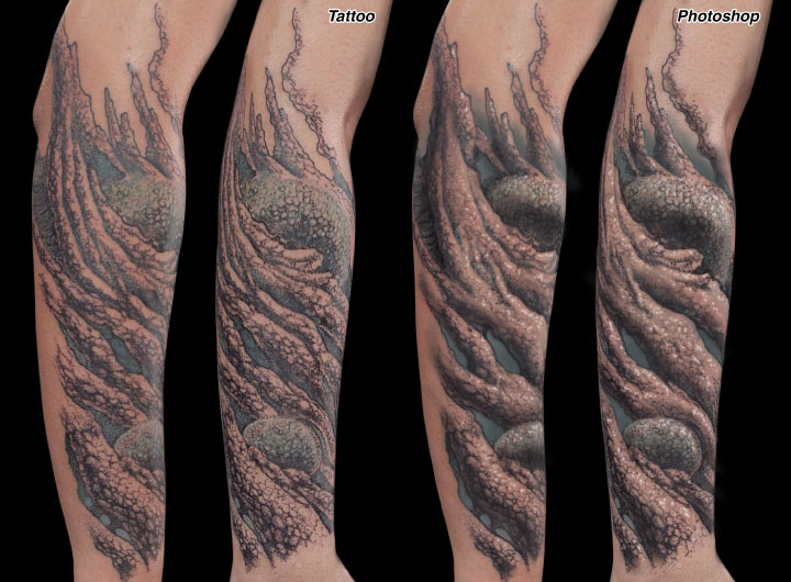
The first piece is a flowing leg design. It's a good example of the things that I like about Breno's work: It looks very natural, like driftwood or twisted bone, and had a good flow and placement on the body part, which is a big part of what makes a good bio-organic tattoo work well. There's also plenty of nice texture and detail, balanced by simpler areas to keep the piece from looking busy. So a lot of the important ingredients are there.
One of the first things I usually ask myself when critiquing anything- including my own drawings during the tattoo design process- is, what can be made larger? This is for the purpose of fitting the body part with the maximum strength and clarity. Lower leg pieces can benefit from larger shapes because they are generally seen from further away than arm work. So that was my first move, to make the overall design larger to really fill the body part, with some longer shapes in the upper right to exaggerate the flow. This difference in size will not make for a huge change in terms of the amount of time needed to actually tattoo the piece, but the fit on the leg is a bit more dynamic.
Next I've done some background shading, something nice and soft to offset the foreground shapes. The idea is to use a tone that is dark enough to make the negative areas of the foreground pop out, while being light enough not to compete with the foreground shapes' shadows. Generally speaking, when using strong black in the foreground I try to limit its use in the background, and vise-versa. In addition to the soft background, other soft grays are brushed through some of the foreground shapes. I think a use of the full gray range is important in this kind of work, so using some really light dilutions helps bring those foreground shapes to life.
Then there's a bunch of strong blacks and dark grays added to the shadows, mostly in areas where there was already a bit of shading. Sometimes it's nice to just make your dark areas darker to the point where the whole value range is represented. I aim to create a few large alternating areas of dark and light so that the rhythm of the piece reads clearly from a distance. In addition to the stronger shading, I've strengthened the outlines in a few places, while at the same time keeping their use minimal to reflect the softer organic look that Breno is going for here.
Last but not least are a few white highlights. Some artists are reluctant to use white, figuring that it will disappear after a few sunburns. White can actually be a pretty persistent pigment- I have some in me that is over 25 years old, and I've seen it work well in a variety of skin tones. Lower legs get a moderate amount of sun, plus the fact that this client is fairly pale, so they are a good candidate for using white. It is used very selectively, mostly applied with aligner since white tends to be the most effective when concentrated into small areas and supported by surrounding shading. With white pigment, less is more.
The second piece embodies a totally different approach to detail and shading, so I'll try to respect that approach in my critique- as I mentioned before, the goal is not to make it look more like my own organic work. I like a lot of things about this tattoo, and the dotwork approach is a great way to give the shapes a sense of detail and texture, plus just an overall unique finish. But as I mentioned before, I'll always look for ways to make shapes bigger and more clear. In the case of this tattoo, the placement makes that even more important, since the top of the forearm is a spot where things tend to look dense to begin with because of thicker hair, more sun exposure, etc. So as a general rule, when I design for the top of the forearm I try to give the piece some very large, open, high-contrast shapes, especially in the places where the hair is destined to grow back the thickest.
In this case I haven't changed any of the basic shapes, as I did with the previous piece, but instead have eliminated some of the internal shading and detail in order to make the shapes appear larger and more open. This means having a number of areas with very little detail and shading, plus other areas where the shading is much stronger than in the original. That makes for higher contrast and a bolder overall look without having to resort to heavy outlines or any of the other usual tricks that I would recommend.
The way the piece looks in the retouched photos could be handled a couple different ways. In theory it could be done entirely with small black dots, as with the real tattoo, just by using fewer dots in the lighter areas and a lot more of them in the darker areas. But there is also the option of using a magnum and doing some of the shading, especially the big dark areas and the very light washes, with more traditional techniques, then adding the dotwork on top of that in order to get that cool stippled look. There is also the option of doing some of the dotwork using washes, so the dots can express the full range of value. I've also eliminated the dotwork in the blue background areas, so that the foreground separates from the background more easily. At any rate, there are a few different ways to get this same overall look, depending on whether the goal is to be a purist about only using black dots, or if the flexibility is there to use dots of various value and/or additional magnum shading mixed with the dots. A number of different options there, with the end goal of creating stronger areas of dark and light to give the piece more distinction from a distance.
A lot of artists seem to misunderstand what contrast means, and just willy-nilly put tons of black everywhere. Remember that by definition, contrast is about difference- dark areas contrasted against light areas. Dark next to dark is not contrast, it's just dark. A strong alternating rhythm of flowing dark and light shapes is a key goal for almost any tattoo that I do.
And of course I'll recommend some white highlights, and in keeping with the dotwork theme the highlights are all done in dots as well, using the same size needle as the black dots to keep the look consistent. White is concentrated only in the most open areas of the foreground shapes, done with a sense of restraint. No highlights are placed in dark or medium areas, for example, since that would start to cancel out the effect.
These are both nice tattoos with a very natural organic sensibility, and I think the differences in the way that Breno renders his work are core aspects of the style that he is developing. I hope my critique had respected those differences while at the same time brought to focus some things that could be done in future work to take this unique approach and make it stronger, bolder and more readable. As with so many up and coming artists, I am very excited to see what Breno is doing in the near future. Tattooing is evolving so quickly that it can be a bit dizzying, but we are all capable of evolving along with it.