


Ask Guy December 2012 2
Welcome to the second installment of my column, Ask Guy, where I'm responding to questions from both artists and collectors. I want to thank Tattoo Magazine for providing the space for me to do this here. Since Tattoo Magazine is available to the general public, I won't be answering any questions about nuts-and-bolts technical matters. Instead, I've found that most questions about doing better tattoos can be addressed with discussion of design, such as the color theory in last month's issue, and that understanding these ideas can be helpful for both artists and collectors. Other tattoo related subjects are welcome too. Go ahead and hit me up with my contact form.
Q) I've been tattooing for almost five years, and where I'm at, black and gray is really popular. It's really what I want to specialize in, and believe me, I've had plenty of practice. I feel like my work is smooth and my lines are clean, but I admit that it's a little flat. I'm ready to take it to the next level... Could you tell me some good general rules for doing great black and gray work?
A) A lot of the rules that apply to black and gray design also apply to color. Really, it's about good tattoo design, period, with a few crucial differences. It's so simple and so complicated at the same time- I'll try to work on the simple part first:
1. Make your shapes big enough so they use the space effectively
2. Give the shapes a nice flow on the body part
3. Create a strong rhythm of dark and light through the piece
OK, that's the part that you could write on the palm of your hand. Putting it all to work is another matter though. Each of these points could be a book unto itself, so I'll try to boil it down to the bare essentials. First, Point number 1: Make your shapes big enough. That sounds elementary, but look around you and you'll see many examples of tattoo work that appears jumbled from a distance. It's one of the most common mistakes in tattoo design.
Both of the examples in Fig.1&2 are drawn from the same client request: A snake with water, using the shoulder area, with a four hour budget. In Fig.1, the artist felt compelled to include the whole snake, which made for a busier design and caused everything to take longer because of the extra detail demands- which in turn meant designing the piece smaller so that it could be completed in the allotted time. Even if such a design is drawn very carefully, it will still appear busy from a distance, not to mention being a more tedious project to actually tattoo.
In Fig.2 we see a whole different approach. This time, we are aiming to make all the shapes in the design as large as we can and really make them flow with the arm. By going with big flowing shapes, the design can be a little larger than the first example, even on the same budget. Way less of the snake is visible- instead of the whole writhing mass we show just enough to give the idea that there's a snake in the water. These parts are then made much larger and drawn in a way to flow with the body part nicely. In addition, the second example is much easier to expand into a sleeve, where the first example will always just look like a smaller tattoo that's been added onto. It's simply good business to make your work easier to expand.
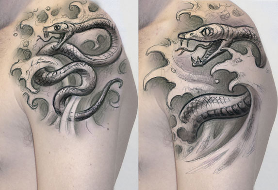
Fig. 1-2: By going with a bigger snake and bigger waves, it's possible to do a larger tattoo on the same time budget as a smaller, more complicated piece.
You'll notice that I just touched on Point #2- Make the design flow on the body part. That, too, is elementary, and should always be a part of any tattooist's design objective on all but the smallest tattoos. By working primarily in big flowing shapes, you'll avoid most of the pitfalls that lead to that flat, jumbled look. We'll get into the flow subject a little more as we discuss Point #3: Give the design a strong rhythm of light and dark.
In the case of the Buddha drawings below, using big shapes meant making the head and hand as large as the space allowed for, and going with two big roses instead of sixteen little ones. That makes the face into a big oval shape that fits the deltoid muscle, with the roses laid out in a diagonal flow so the bottom of the tattoo drapes nicely. Even with a strong layout, though, there are some ways of shading the piece that are going to give you stronger results than others... ultimately, it's about establishing contrast.
The first example, in Fig.3, is an approach I take more often than not. By making the foreground shapes significantly lighter than the background, the illusion of them coming forward is very simple and recognizable even at a quick glance. Crucial to this strategy is avoiding strong blacks in the foreground shapes such as the face and hand, so that these elements don't merge with the background. At the same time, the background is saturated fully in order to give maximum support to the foreground. The net result is a strong alternation of light and dark in the piece, so even when viewed from a distance, you can clearly read it. It's the distinct difference between the dark and light areas of the piece that give it contrast.
Fig. 4 shows an equally valid approach, where strong shading is used in the foreground but little if any is used in the background. Foreground shapes are shaded thoroughly, with light washes used to round off the lighter areas and create a smooth and refined overall look. If you go with a light background, it's important to use enough saturation in the foreground so that the layers of the design separate. You can also see in this example how the hand and clothing get lighter and drop out before coming into contact with the rose, almost as if a layer of mist is separating them. This is a very useful tool for clarifying your design and keeping it from looking busy.
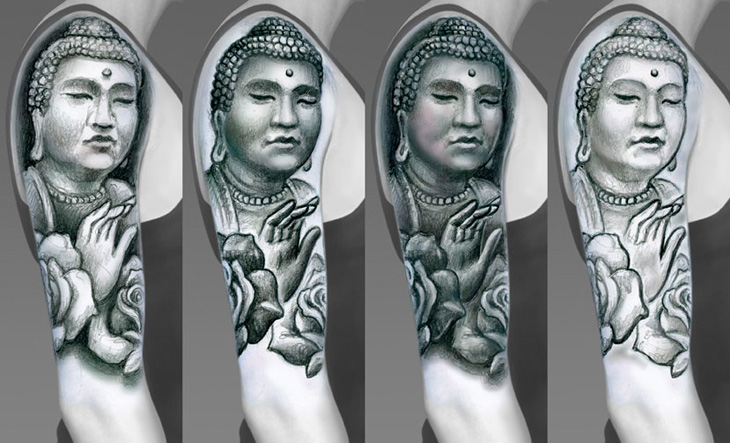
Fig. 3-6: Contrast is all about differences, such as having a light foreground with a dark background or a dark foreground with a light background. Dark on dark can look dense and blobby from a distance, while light on light can look weak and unresolved
Fig. 5 & 6 are intended to show what I consider to be widespread mistakes in tattooing, and are especially common with black and gray. In Fig 5, the drawing is shaded equally throughout, with every shape getting the full depth regardless of how its neighboring objects are shaded. It's basically like taking the darkest parts of the first two examples and combining them. It may not look terrible, especially if done smoothly... but from a distance, things really start to blur together and take on that jumbled look. Giving a design this much shading does not give it more contrast- a high contrast design is one where dark and light elements interact with each other in a visually dynamic way.
The final example is almost like a combination of the lightest parts of the first two examples. Again, it doesn't necessarily look terrible, but the piece lacks depth and won't hold up as well over time. Strong shading can really give the forms in a tattoo the support they need to stand out. Don't be afraid to go deep in a few places. If you're not sure how to approach the shading, start on paper first.
Of course, the next step is to refine your technique on skin to a point where you get good smooth healed results... but that's another story entirely, and something that in many ways needs to be learned from many hours of tattooing, period. But having a strong understanding of fundamental design gives you a solid place to start. I've always felt that a good design can handle an imperfect execution, while a bad design, even done with the slickest technique, is still a bad design. Building up your rudimentary art skills is key.
I recommend that you drop by my educational website, www.tattooeducation.com, where we offer books and DVDs going into aspects of both design and technique, offered by some of the industry's finest talents. Although many of these items are only shipped to established tattoo businesses, we also offer a lot of very inspiring books for collectors as well, showing the state of the tattoo art as it stands today. Whether you are an artist wanting to improve your game or a collector trying to learn all you can about what can be done on skin, we hope to be able to help.
Thanks, and I'll see you in the next issue!