


Welcome to the latest installment of Ask Guy, where I'm taking questions from both artists and collectors about all questions relating to the tattoo art form. I'm hoping that with my 26 years in the industry I can help shed some light on some of your trickiest questions. This year I'm mainly focusing on critiquing, since that's really a way to cut to the chase and see what needs improvement and what you're already doing right. I'm writing these critiques with everyone in mind so they should be useful for any artist, not just the one who is the subject of the critique. I'm also trying to present this in such a way that can help collectors to get a better idea of what makes a good tattoo and what to look for when shopping around for an artist.
I recommend that all artists, especially the ones that are still finding their place in the field, sit down with others and review each others' work from time to time. Make a habit of it if you can, where you can speak candidly about what looks good and what needs improvement. A good critique should not be meant to bring anyone down, but also needs to be honest. Usually the comments you'll hear will simply reinforce things that you already suspect, but hearing it from another artist can put it in a more useful perspective. This month I'm looking at the work of Rebecca Smith, who works at Classic Tattoo in San Marcos, Texas. I've asked her to fill me in a little in terms of what she's specifically struggling with- very helpful when it comes to making a critique useful. She says:
"Looking at these pieces, my main problem is that I feel like there are some things that they are lacking that would make them more interesting. I love doing folk type art and leaving skin, but sometimes I feel like I leave too much maybe, or I just don't push my tattoos to that next level of work. The same for the rose sleeve, but the flow is also something I feel like I missed. I have your book Reinventing The Tattoo, and I always go back when I draw a sleeve and read about flow. When I try and apply it to skin, though, I just feel like I'm missing the mark."
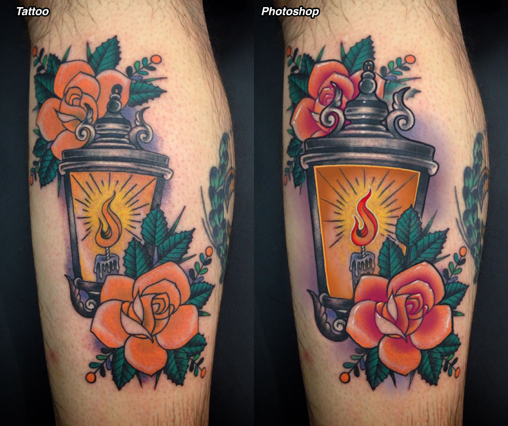
So, let's start with the lantern piece. This is a nice little tattoo but you are correct that it could be pushed further. Some things I'm about to suggest could actually be applied to this piece if you were to get him in the chair again, but other things will just have to be applied to future tattoos.
For starters I think the lantern is too small. It's similar in size to the roses, which isn't the most dynamic way to lay out three elements... plus, it is the central element while the roses are supporting features, so it should be bigger than them. Plus, this would make it read better from a distance. Also worth mentioning is that the highest leaf of the lower rose has a central line that closely coincides with the edge of the lantern- this is always something to try avoiding during the early stages of drawing, to prevent visual confusion. So that's the first thing I've done, is to make the lantern a bit bigger, and to build up its outer line to give it more priority. Note that I've also built up the outer lines around the roses (what I refer to as the peripheral line) and left the rest of the outlines alone. This gives the main elements of the design more priority compared to the more incidental details, which contributes to its overall clarity.
I've done some other stuff to the lantern as well, most notably the color outlines on its interior and the deeper color gradient inside it. The color gradient gives the piece more depth (long gradients are great for depth, even in a traditional looking piece like this) plus some careful color outlining to give the impression of light playing off the inside of the lantern's cage. This can be done in such a way that still retains most of that classic look while still having an enhanced sense of luminosity. Red is generally a reliable door to outline with.
Speaking of gradients, I've deepened the color in the roses and made their gradients richer, giving the roses more depth. The color you had used was a little pale and flat, although the smooth blends were handled nicely, so I've just shaded them a bit more without changing their overall rendering too much. I've also lengthened and softened the purple background gradients, for the same reason- to give the piece more depth.
Then there are some things done to give the piece a bit of selective focus. This includes deepening the color in parts of the flame to give it some contrast- as it stands it's what I refer to as a negative on negative relationship between the flame (a light color) and the background (also a light color). Generally I encourage having either a strong pos on neg relationship, as pictured here, or a neg on pos relationship, where the flame were made light yellow and the background a darker color. Either way is fine, but it's good practice to avoid neg on neg or pos on pos relationships, just for the sake of clarity.
Finally there are some white highlights, done with a liner in just a few key areas to give the tattoo some selective focus. This includes a white outline around the flame, and a few line and point highlights in the roses and lantern. I can see that you've used a bit of white in the lantern, probably put in with a shader. The reason I recommend using a round group is that white seems most effective in tight lines or points, put in slowly and carefully. As a more traditional tattoo artist I understand a reluctance to rely on white, which has a reputation for not holding up. The thing is, I have white in my own collection that's over 25 years old and still going strong. It's subtle; it starts out that way and stays that way. Rather than relying on it I like to use it to bring focus and enhanced detail to a few selective elements, as I've done here, which is just more visually effective.
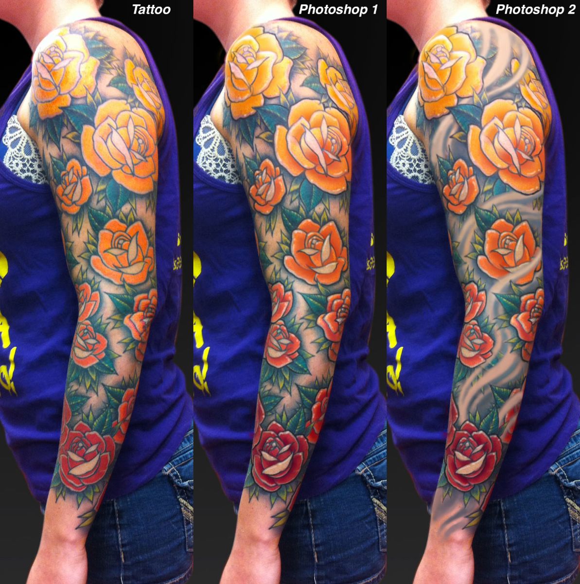
With the rose sleeve, I'll show you two different approaches. For starters, I'd like to say that it's a good overall layout, with attractive spacing and placement. The sizes vary nicely and there's a good rhythm between them. The color gradient happening inside the roses down the length of the arm is a cool effect too. I'm sure she is very happy with it. Anyway, with my first approach I'll just give the roses a bit more polish, as I did with the lantern piece.
This involves giving the roses more line weight, mostly just the peripheral lines around the main rose shapes. This by contrast makes the remaining lines appear finer. I'm a big proponent of varying line weight, which can give a large complex piece a greater level of strength and readability. In addition to the selective use of bolder lines, I've also gone deeper with the gradients in the rose petals, giving them more depth while still being mindful not to go too dark with them, which might chop the roses up into a clutter of little high-contrast shapes. Instead, I'm going just rich enough in just the right places, plus adding the same white point and line highlight effect that I used in the lantern tattoo. Overall this gives the piece a little bit more visual reward, which is I believe what you were looking for.
That just adds polish to the piece, which could still happen with this sleeve if you wanted (see Photoshop 1). With the second approach, in Photoshop 2, I've added a swirling negative space element, which weaves in and out of the roses and provides all kinds of opportunities for flow and depth. Since flow is a concern to you, this is worth taking note, since it can sometimes be a challenge to create flow in a one-element design like this, and swirling smoky skin can do just the trick. It also allows you to keep a fair amount of untattooed skin in a tattoo like this.
Obviously, this is something that needs to be planned into the piece to begin with, not just added as an afterthought. The idea is to create a strong flowing movement that is not too chaotic and follows a winding, S-curving path up the arm in a way that flows with the anatomy. This kind of flow could potentially be achieved with roses alone, but they would have to be large, highly stylized roses that were bent in the right way to achieve what the negative space swirls easily accomplish.
With both pieces, the general layout and color use is good, the drawing style is attractive (important!) and the execution is clean. But you are right: there are extra things that can be done to take these pieces to the next level. It just takes a little more time in some cases, and a little more planning in others.