


Welcome to this month's edition of Ask Guy, where I've been taking your most challenging questions over the past several years, and trying to make sense of them. For this past year the column has been focused mainly on critiquing, since that seems to be a great way to demonstrate exactly what an artist could do to take their work to the next level. Critiques are a long standing tradition in the art world, and although some tattooists have been sort of scared away from posting their work on public tattoo forums for fear of being torn apart mercilessly, there have been plenty of safe places to go where you can get honest feedback. One simple route is to just sit down with your coworkers every month or so, have a beer and critique each other's work. Doing it in person can take away a lot of the intimidation that you may feel when strangers are in the safety of their anonymous online profile and can get as nasty as they want. That kind of critique can do more harm than good, so I wanted to talk a little about what can make a critique useful.
For starters, I always try to find the strengths in the work and point them out. Most tattooists have at least a few of them, and its sometimes not obvious what they are. If someone does particularly good linework but their shading needs attention, it doesn't help just to say that the work looks sloppy- being specific is where it's at, when you can say, "your lines are nice and clean, now you just need to smooth out your shading to match the quality of the linework". In addition, when I make critical statements about someone's tattooing, I always try to make suggestions about how to improve it. Just saying that the work sucks is discouraging and can leave the person you are critiquing feeling discouraged and deflated. For some folks, this can be a fun game- let's call it "sink the apprentice"- but it's not the point of critiquing. The whole purpose is to find ways to improve the work, not just to recognize the depth of its shortcomings. By itself, that is the opposite of helpful.
In today's column I decided to focus on one issue: Positive/negative relationships. Pos/neg relationships describe how the dark and light areas of a design interact, and have a lot to do with how clear or readable a tattoo might be. I've talked in detail on this subject for many years, as owners go my book Reinventing The Tattoo can attest to. The book is now out of print but instead can be found in a fully updated electronic edition, complete with new chapters and material from guest writers, at TattooEducation.com, my educational website.
The piece in question is by up-and-coming artist Justin Klink. Like many artists in his position, Justin does a variety of different styles and is still evolving toward his own trademark look. I looked through number of his pieces and most of them were very smooth and well done. The tattoo I've chosen is clean and well executed, but could use some help in terms of its pos/neg situation. Instead of critiquing multiple pieces, as I normally do, I figured this would be a good opportunity to use this one example to talk about the importance of clear pos/neg relationships. You can see that I've done two different Photoshop renderings of the piece in order to more clearly explain what I'm talking about.
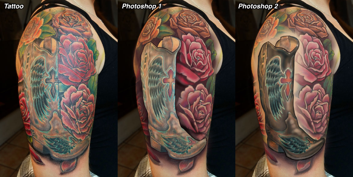
First, let's take a look at the unretouched piece. The compositional layout is pretty strong- his choice of working with several large roses instead of a mass of little ones, for example. The boot is about the right size for the spot- I always recommend trying to make your shapes as large as possible for the spot you're working with. For this boot, I think that any larger would have made it distort too much. So far so good: large boot and rose shapes laid out nicely on the arm. The only change you'll see from the basic layout is that I added a little more curvature to the front line of the boot, which I think is otherwise too straight up and down.
The big changes come with the use of dark and light, which you can see in the two Photoshop versions. In the original piece, I think the whole design mashes together a bit, especially when seen from a distance, despite the use of bold linework around the boot. This is because the amount of dark and light shading in each of the different design elements are all pretty much equal from one part of the tattoo to the next. To get clearer readability, there need to be distinct and separate areas of dark and light. In the version labeled Photoshop 1, you can see that I've added strong shading behind and around the boot, making area of background immediately surrounding the boot notably darker than the boot itself. I've gone stronger with the use of black in other areas of the design as well, while keeping the rose petals a little lighter in order to contrast the dark background, and have lightened the details within the boot a little too so that the boot jumps out.
Details within the boot are done using mostly grays and lighter colors, with only tiny amounts of black used to accent the feather designs. Limiting the use of dark shading within your negative shapes is key to keeping your pos/neg relationships clean. In that same spirit, I've lightened the upper areas of each of the roses to prevent the whole piece from getting too dark.
I believe a lot of people sort of misunderstand what is meant by the word "contrast". I think some just get the impression that contrast simply means using black, and then go ahead and put plenty of black shading in every single part of the tattoo. This can simply make for a dense tattoo, not necessarily any more readable than a piece with too little shading. In fact, contrast is about difference; when two neighboring shapes are very different from each other, whether it be in color, value (dark-light), texture, or what have you, then they contrast each other. In order to make things stand out as much as possible from each other I generally recommend choosing either your foreground or your background, but not both, and using your strong black shading there- possibly using more black than you would normally think to, but only using it in select parts of the tattoo. This does the opposite of that effect where everything has the same amount of shading, causing it to all blob together. Instead, by being selective, you have large areas of strong dark and light that clearly read from across the room.
The the second example, Photoshop 2, you can see I've done the opposite- instead of being negative on positive, as in Photoshop 1, this time it's pos on neg. Darker shading and color has been used in the boot, but the area immediately surrounding the boot have been left open, with plain skin creating a clear margin between the boot and the roses. This includes letting the outline of the flowers lighten and drop out in the half inch or so around the boot, causing the boot to clearly jump forward. The overall shading in the flowers has been limited to mostly medium values, with true black just in parts of the outlines and mixed lightly in with some of the darker colors in the shadows. Then, true blacks have been used in the boot, just enough to bring it forward without making it look like a black boot. I've left the bottom edge of the boot neg on pos, with the shadow being darker than the boot, since it makes for a more convincing shadow effect.
The advantage of going with the pos-on-neg approach is that it can make for a less dense or dark overall look, which is sometimes desirable. The neg on pos approach, on the other hand, can produce a more convincing depth effect. In theory, either approach could have an overall dark or overall light look, depending on the effect that you're going for.
There is no right or wrong approach; but it is definitely worth considering your use of pos/neg relationships before proceeding. I almost always have a shaded drawing prepared before tattooing- sometimes very rough, but enough for me to know where my dark and light areas are going to be, how the gradients will work, and what the use of pos/neg relationships will be. This allows for complex yet readable tattoo designs. The tattoo that Justin submitted is nicely done in many ways, so by taking that foundation and then incorporating a decisive use of pos/neg relationships, you'll have a formidable toolbox of tattooing skills for use in any style or subject.